

Project overview
The product:
Affinz Bakery is a regional bakery store located in the metropolitan area of Lagos State. Affinz Bakery Store serves nutritious bakery products and soft drinks. They offer a wide spectrum of competitive pricing. Affinz Bakery targets customers like workers and nonworkers who wants sweet and freshly delivered bakery products like cakes for
ceremony or anniversary or wants pizza, shawarma or bread for a fast meal for themselves or with loved ones.
Project duration:
November 2022 to January 2023
The problem:
Bakery products lovers most times can not get to the bakery store due to their tight schedules. They also get worried about meeting and queuing at the store, and also about not carrying physical cash to make payment.
The goal:
Our Bakery App Will easily enable users skip in-store order line, place order and make online payments.
My role:
Lead UX/UI designer, UX researcher, etc. I designed the app for Affinz Bakery from conception to delivery.
Responsibilities:
Conducting interviews, paper and digital wireframing, low and high-fidelity prototyping, conducting usability studies, accounting for accessibility, and iterating on designs.
User research: summary
The primary user group identified through research was both working and non-working adults who don’t see going out to the bakery store and the possibility queuing as ideal. I conducted research and created empathy maps to understand the users I’m designing for and their needs.
The assumptions about Affinz Bakery App was confirmed by the identified user group and research
also revealed that tight schedules was not the only reasoning preventing users from going to the Bakery store to place order, other user problems included long queues at the store, difficulties making the bakery product at home, lack of physical cash to make payments and stores not accepting certain bank cards for payments.
User research: pain points
Payment Issues
It gets frustrating for users when the store they visit to make purchase don’t have online payment planform
Issues going out
Living the house most times in search of where to get good food frustrates users most times
Delivery
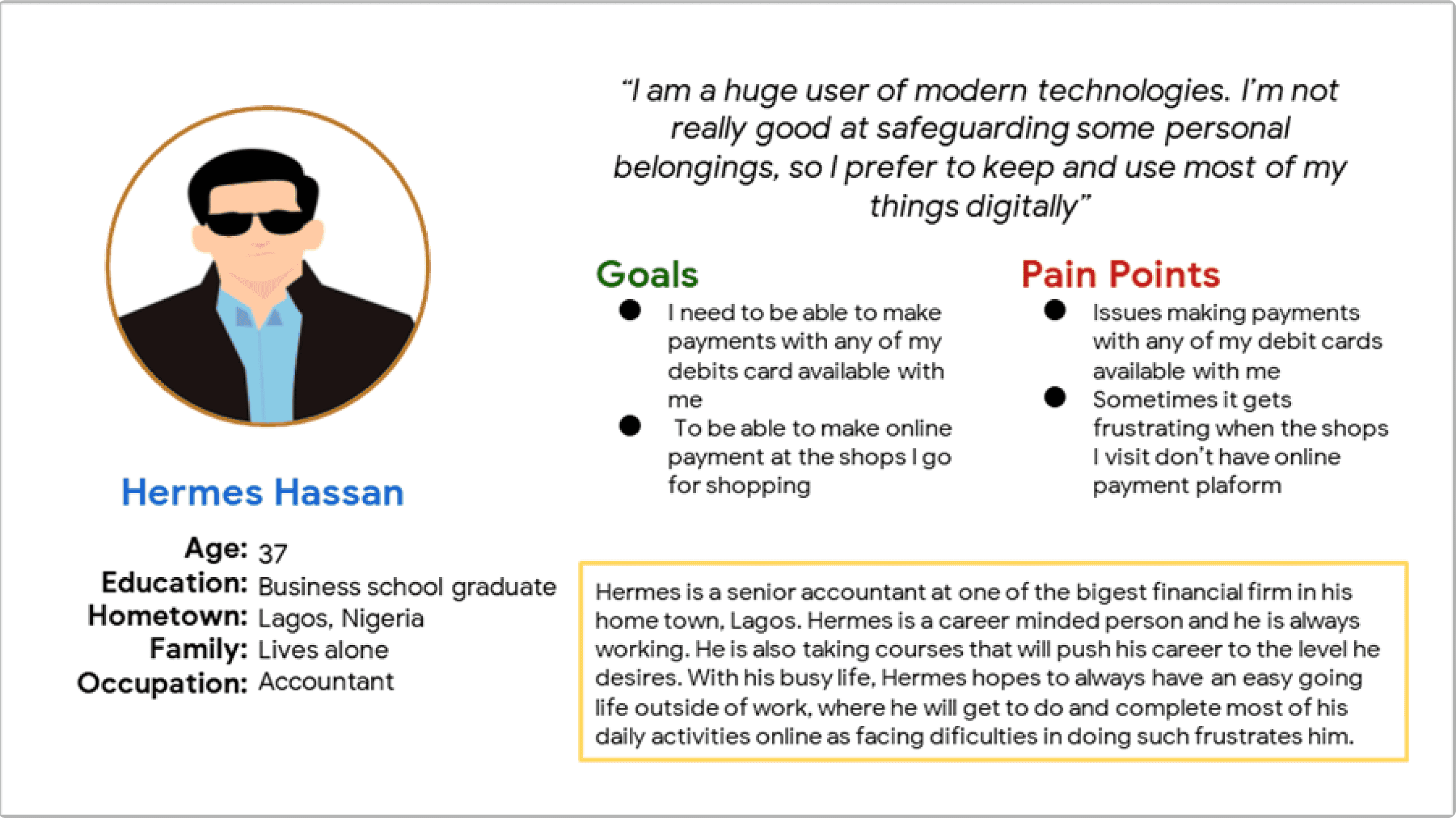
Persona: Hermes
Problem statement:
Hermes is a busy working class man who needs an easy going life outside work, that is aided
by technology which will enable him place orders for his favorite bakery products and make
payments through digital platforms.
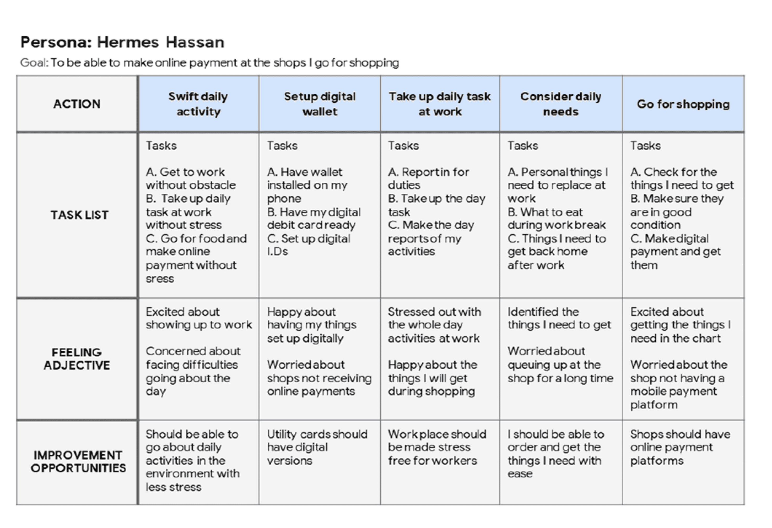
User journey map
The map of Hermes user journey shows how helpful it would be for users to have access to a dedicated Affinz Bakery App where they get to place order and make online payment.
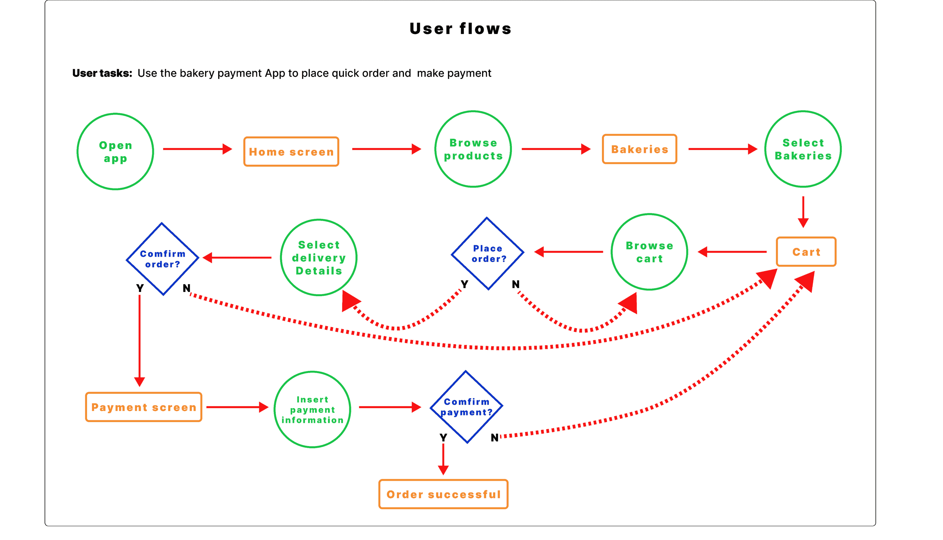
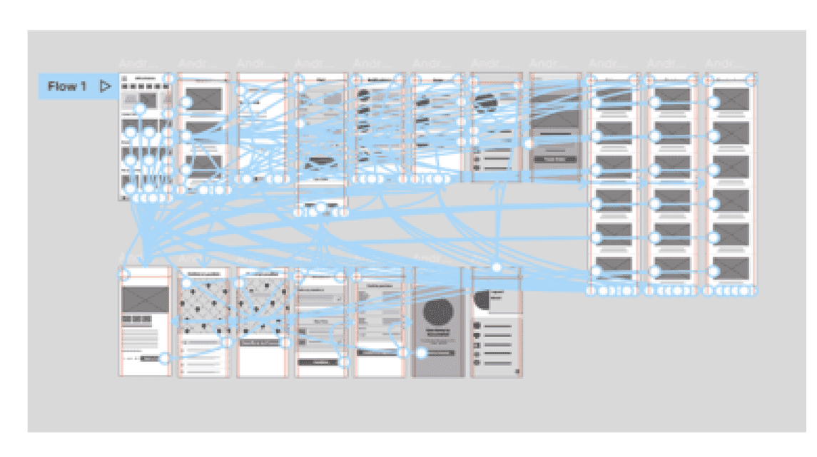
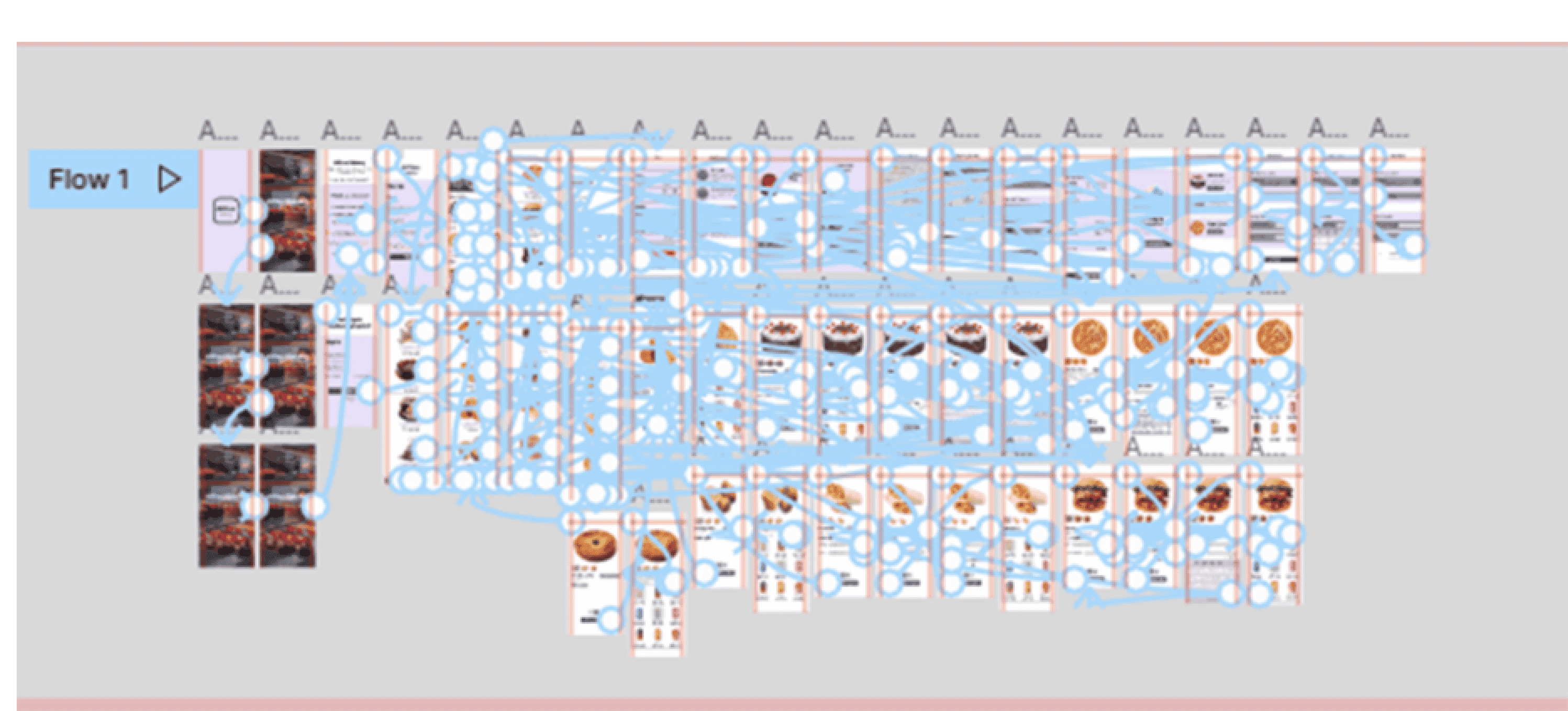
User flows
Paper wireframes
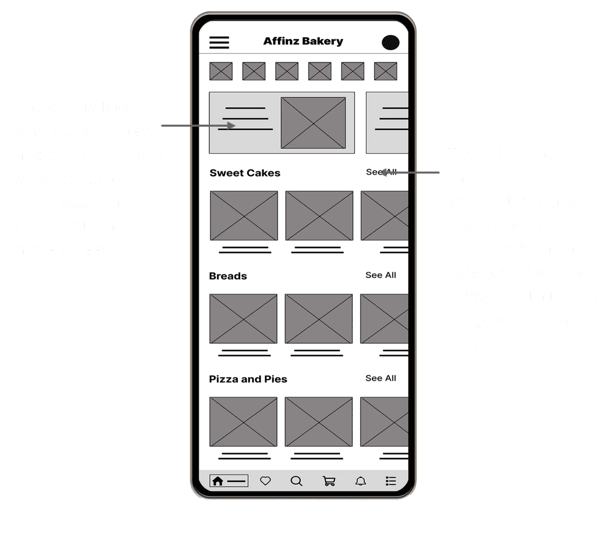
This design sketch iterations prioritizes the home screen, in the effort to make it easy for users to browse through their favorite bakery product and make their quick order. This design draft iterations on paper ensured that the elements that made it to digital wireframes would be well-suited to address user pain points.
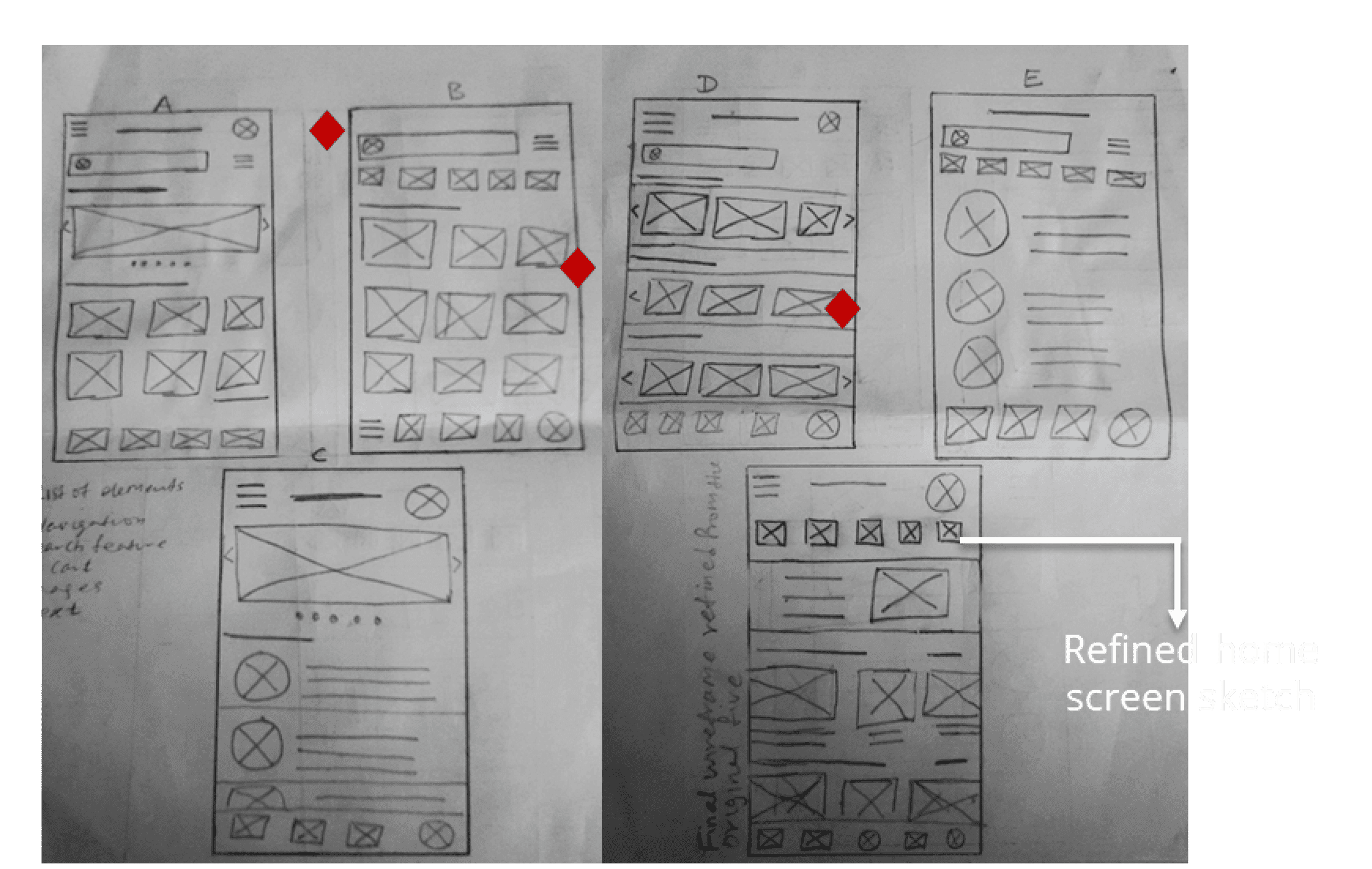
Red diamonds were used to highlight the elements from each of the five sketches that made it to the final refined paper wireframe of the home screen and to the digital wireframes.
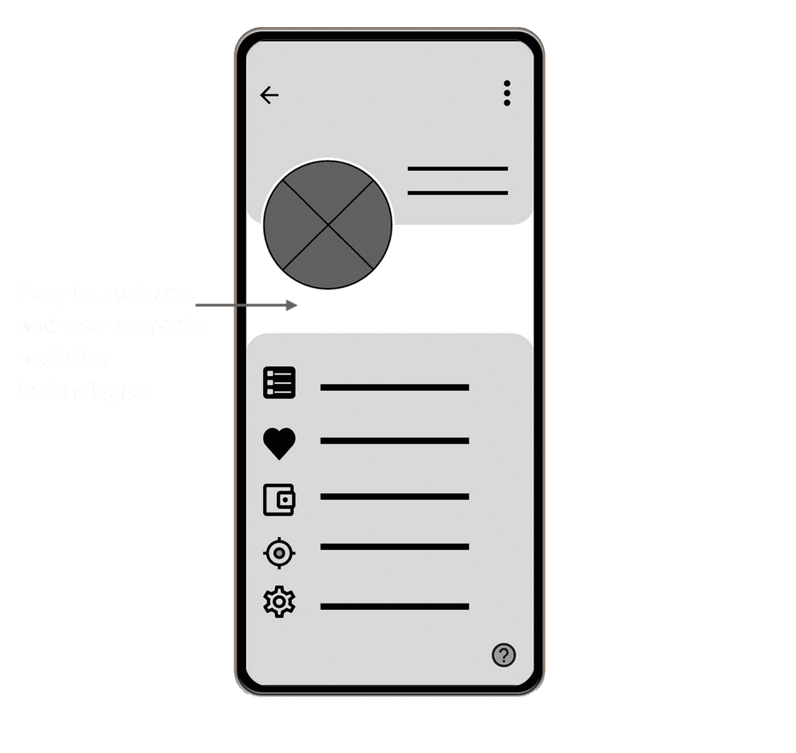
Digital wireframes
As the design process evolves, I made sure that screen designs and iterations are made based on feedbacks and findings from the user research.
Key user needs I addressed in the design, based on feedbacks is easy navigation. The app is also built to work in line with assistive technologies.
Low-fidelity prototype
This low-fidelity prototype made use of selected sets of digital wireframes. It focused on the primary user, which from browsing and selecting preferred bakery product, selecting delivery location, making payment, confirming payment and successfully ordering. The aim was so the prototype could be used in a usability study.
View Low Fidelity Prototype
Usability study: findings
Two rounds of usability studies was conducted. Tge findings from the first study helped guide the designs from wireframes to mockups. The second study used a high-fidelity prototype and revealed what aspects of the mockups needed refining.
Round 1 findings
Users want an easy to use App
Users want clear navigation buttons
Users want confirmation screen
Round 2 findings
Users complain about App primary color combination
Home screen navigation buttons is confusing
Users complain about having to input delivery details in every product they select
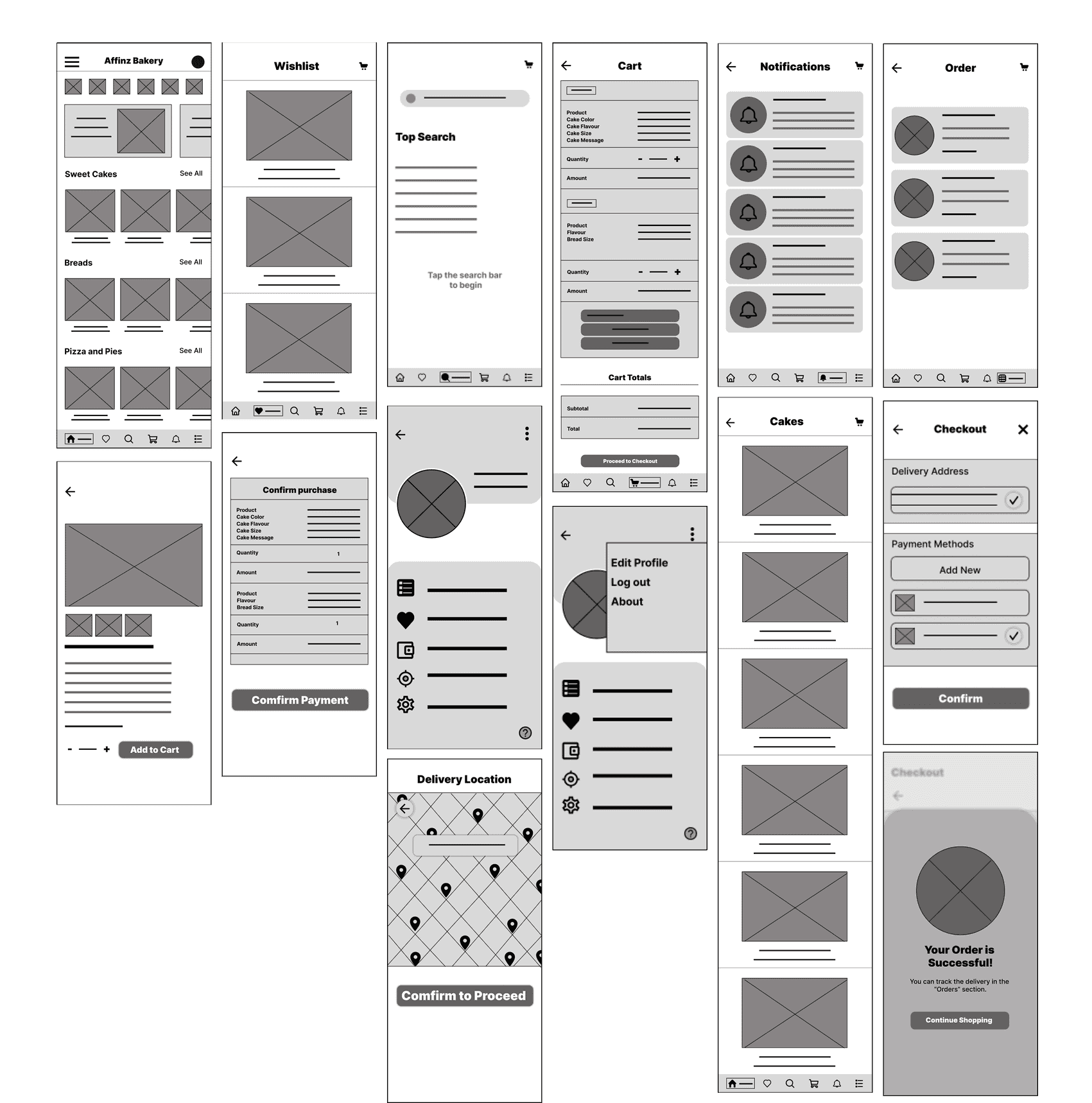
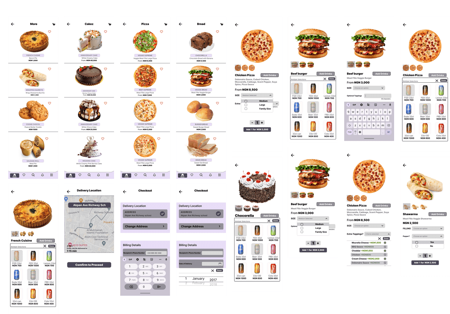
Mockups
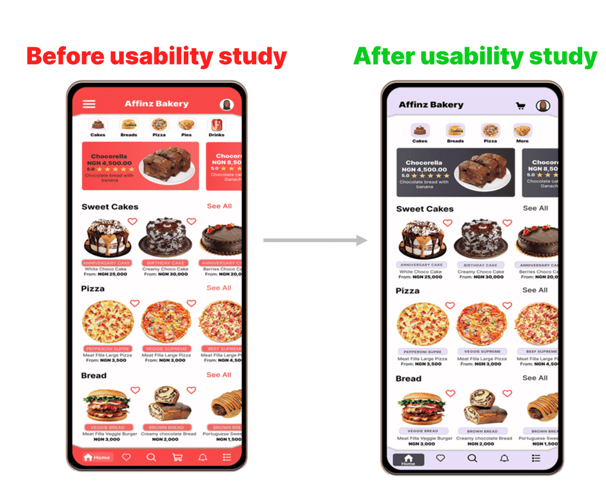
Initial design primary color featured "Sunset Orange" the design also featured "hamburger menu icon" at the top right, but after the usability studies, I changed the navbar and the product tag color to "Saltpan". I also "removed hamburger icon" "aligned the App name at the top to top-right". "I moved the cart icon from the bottom Navbar to the top-left Navbar, plus other color changes". This allows easy navigation
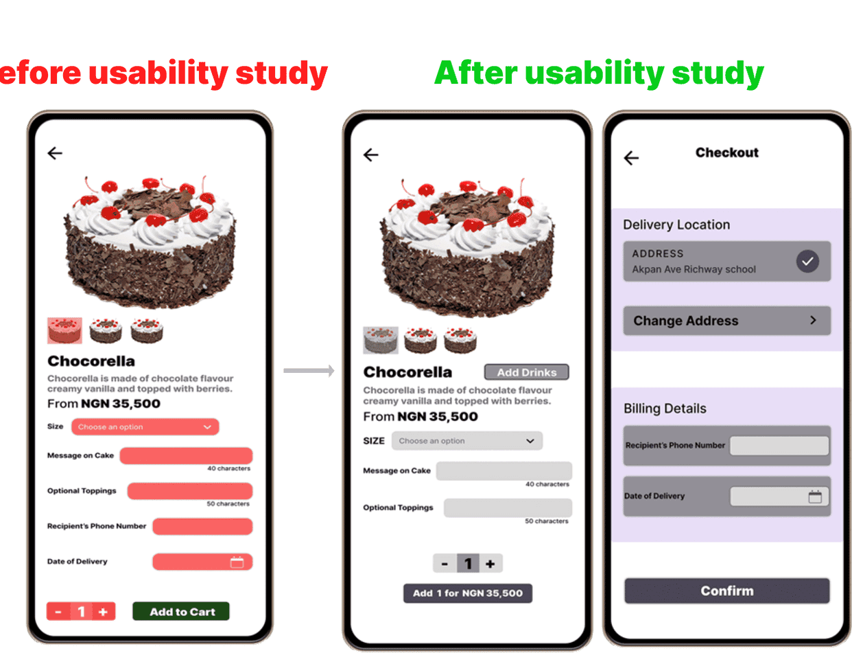
The second usability study revealed frustration with order process. To solve this pain point, I removed the billing details like “recipient’s Phone number” and “date of delivery” from each product screen and designed a second checkout where users get to input this details after all needed items have been add to cart.
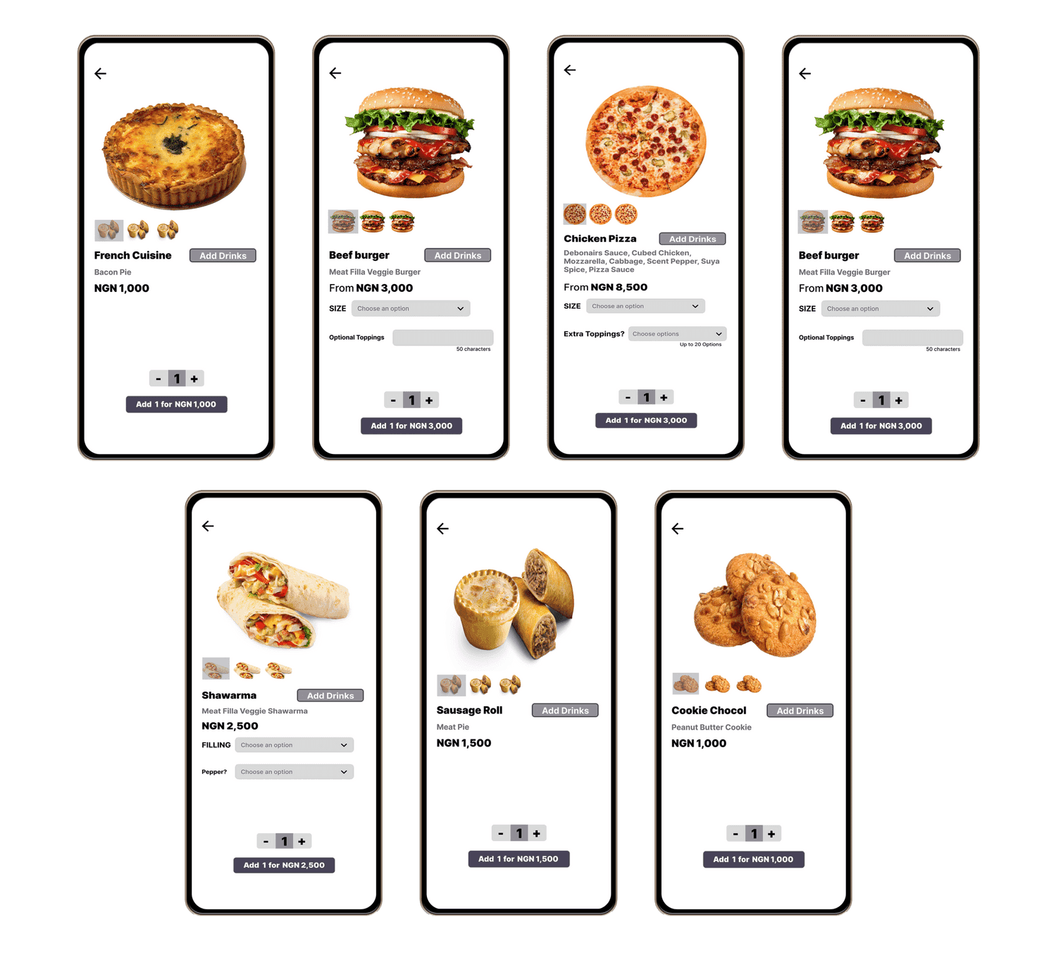
Key Mockups
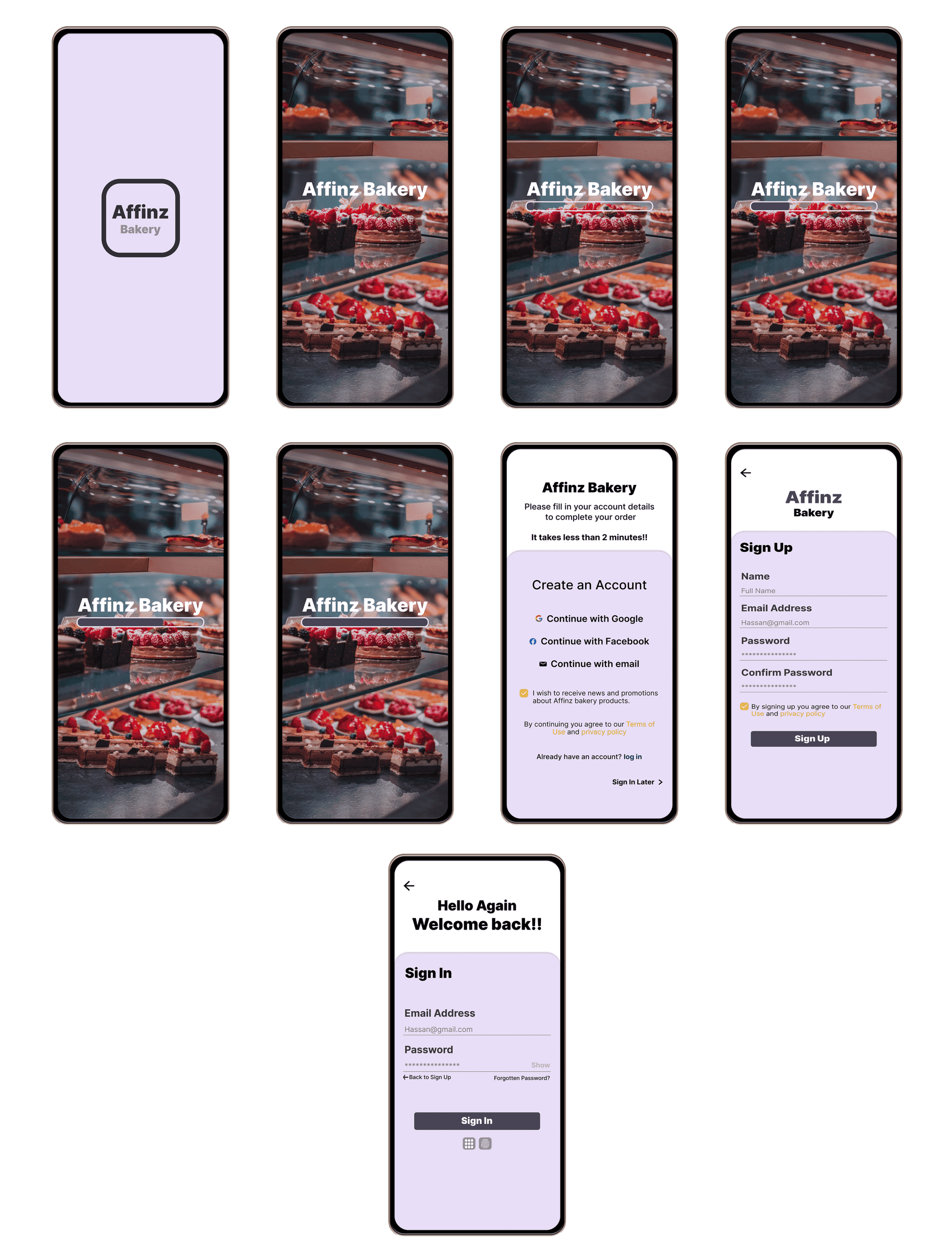
Loading and Login Screens
More Action Screens
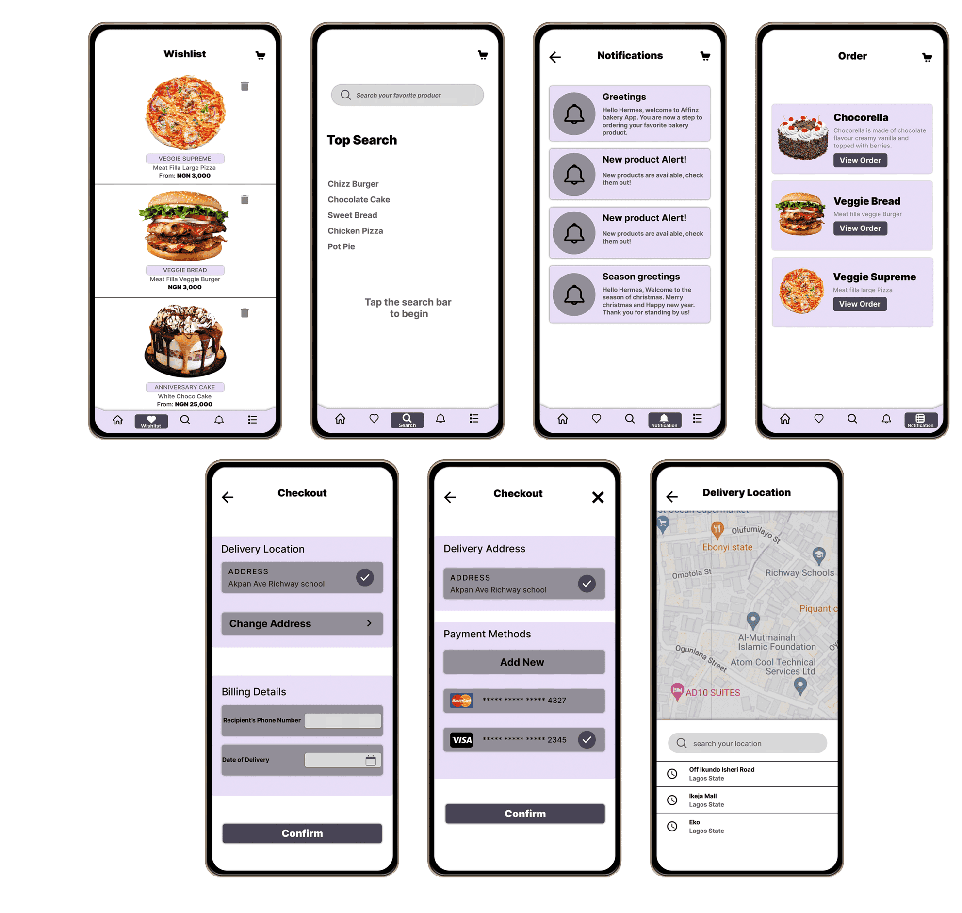
Some Product Screens
Order Screens
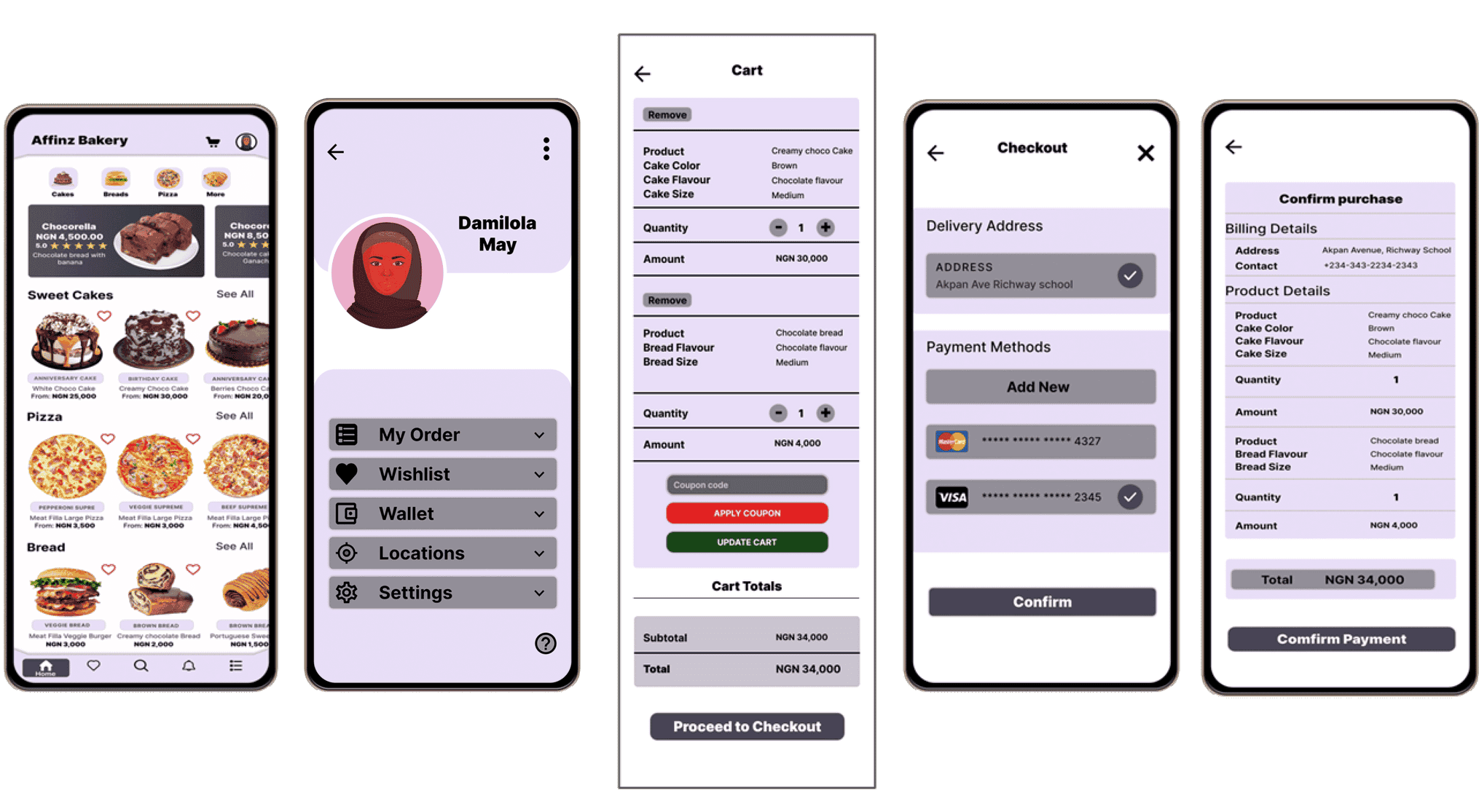
High-fidelity prototype
The final high-fidelity prototype presented cleaner user flows for browsing through and selecting products, inputting billing details, making payment, confirming and tracking order. It also met user needs for a pickup or delivery option.
View hi-fi Prototype
Accessibility considerations
Access to users who are vision impaired through adding alt text to images for screen readers is provided.
I made use of detailed imagery for bakery products and toppings to help all users
better understand the designs.I made use of icons to help make navigation easier.
Takeaways
Impact:
Usability studies on the app overtime have shown positive results about Affinz Bakery App, stating how easy the App will enable users connect with their favorite bakery products, right from their comfort zone.
What I learned:
During the process of designing the Affinz Bakery App, I discovered that the first ideas for the app is only the starting point of the process. There is no limit to how the App can actual evolve in line with user feedbacks and usability studies, which was primarily what influenced each iteration of the app’s designs.
Next steps
Conduct another round of usability studies to validate whether the pain points users experienced have been effectively addressed.
Conduct more user research to determine any new areas of need.